

Initial research into user experience best practices was conducted and courses on the topic completed.
Before designing the usability study some preliminary research was conducted using the following methods:
1. Google Analytics of user flow, page visits, and google tag manager tracked events.
2. HotJar heat maps on 12 of the main content pages of the website.
3. Analysis of competitor and other industry specific websites.
4. Feedback from internal users, both solicited and volunteered.
To determine how users interact with the site navigation, they were given 4 tasks to complete under observation. They were also asked 5 questions at the end of the session for more direct feedback.
The tasks spanned the breadth of website usage and were observed by members of the marketing and human resources team who took thorough notes and later mapped the user flows.
1. Find information about membership eligibility and apply for credit union membership (stop at application).
2. Determine the rate for a 36 month CD and open a CD account (stop at application)
3. Find the branch location nearest your home and determine what the hours are today.
4. Find information about identity theft.
User flows for each of the tasks varied wildly. Some were as expected, others showed that there was no flow – each user taking a staggeringly different route to the information.
Navigation needed to be simplified. Too many choices left users confused. Important navigation links and calls to action were missing. Users indicated frustration with some elements.
1. Proposed simplification of navigation structure and naming conventions.
2. Proposed stronger calls to action and better placement of these buttons.
3. Proposed redesign of tables and accordion menus for better navigation of dense data and condensed margins between elements to mitigate excessive scrolling.

Navigating the website caused frustration for users who were unable to determine where to go to perform desired tasks.
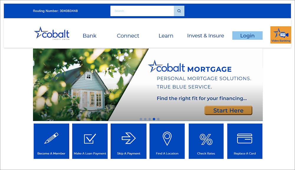
Changing the structure of the navigation to present fewer top level options and allowing the user to filter to their desired page via drop down menus simplified the navigation process.
1. Fewer top level navigation options
2. Search bar in navigation
3. Including navigation for priority links that formerly only existed on the login/apply links page
4. Sticky navigation allows easy access to the site at any point on any page
The login button navigated users to a page full of links causing confusion about which link to choose to log in to online banking.
1. Changing the login button to link directly to the online banking platform streamlined the process, eliminating the confusing links page.
2. Login links directly to online banking
3. Other links on the login/apply page moved into “bank” dropdown menu
4. Links renamed to reflect the destination (not shown)
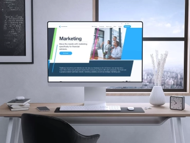
The Cobalt home page did not reflect the purpose of the site or the credit union. Presented information was not optimized to reflect the users needs.
Changing the content of the home page and the way that the elements were presented assists users in understanding the value proposition of the brand and what actions are available on the website.
1. Smaller image allows more space above the fold for content
2. Action icons help users navigate quickly to preferred pages
3. Focusing content on Cobalt’s value proposition clearly communicates the reason that the user should be on the site

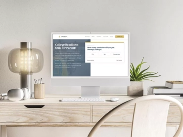
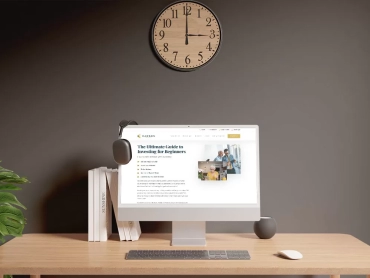
Content acrossed the site was inconsistently written and displayed, creating a disjointed user experience. In some cases it was not clear when users navigated away from the site.
Editing content to use a consistent voice and be formated in a consistent way allowed users more confidence in both navigating and understanding the content.
1. Reduced hero images to allow more content above the fold
2. Clear and consistent calls to action guide users to quick conversions
3. Formating content for scanning and linking to longer content allows efficient browsing
4. Combining pages with related information to reduce the number of clicks to reach desired information
5. Anchor tags to allow quick jumps through page content
Some styling was getting in the way of users accessing or understanding content. Excessive padding caused long scrolling between items. Unwieldy tables made information dense and unapproachable.
Editing the styling on and between troublesome elements made navigating and understanding information easier for users.
1. Reduced padding truncated the scroll
2. Accordion menus broke up heavy text and table sets
3. Hover highlights ensured tables were easy to understand
4. Blog images made scanning for articles quicker (not shown)
5. Blog read time allowed users more confidence in their choice to click or not to click (not shown)
6. Implementing responsive images decreased mobile site load time