

This student project is made up of elements designed around a fictional Italian restaurant called Pasta Amore. Using the provided logo and brand style guide I designed table tents, a menu, a brochure, and a website.
This was my first restaurant related project, and I hope it will not be my last. This set of print collateral was so much fun to design!
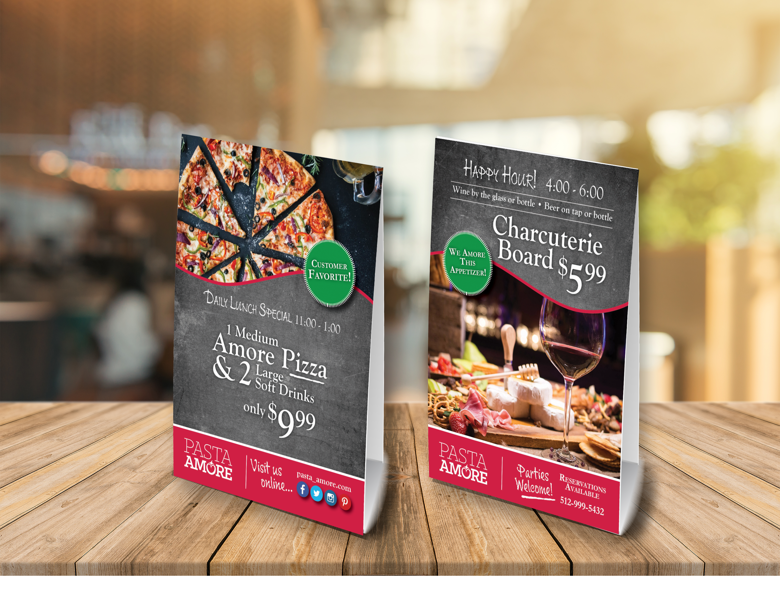
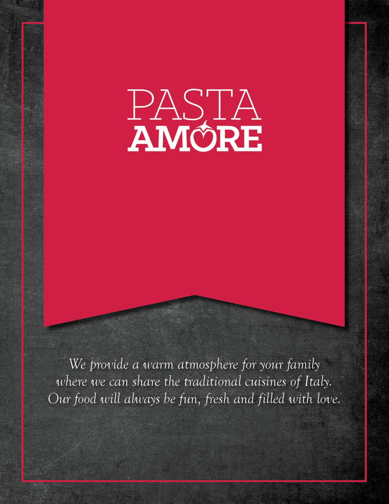
The tone and voice of the brand focus on authentic, market fresh, handmade, Italian and family friendly. This is accomplished much through the graphics of beautifully photographed Italian cuisine which speaks to the handmade and Italian aspects. Placing this against a chalkboard backdrop provides a market fresh feeling and positions the brand as down to earth and friendly. This remains consistent in the brochure as it does through the other print designs. Typography reflects the personality of the brand in that it uses the brand standard fonts Klinic Slab and Goudy Old Style. In addition to the prescribed fonts, the typeface “Chalky” has been incorporated to enhance the chalkboard feeling and grow the idea that the offerings are fresh and reflect seasonal market produce.


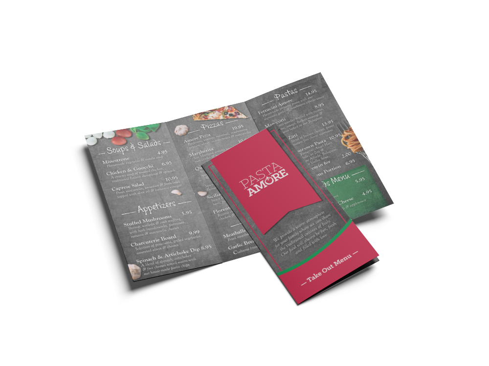
The brochure is formulated to act as a take-out menu. It introduces the public to the restaurant’s story as well as informs them of the restaurants catering services, their locations throughout the city, and their online presence (website and social media). This small piece of marketing packs a lot of information into a small space. The menu takes up the entire inside of the trifold brochure with offerings that reflect a truncated version of the full menu, thoughtfully eliminating items that might not travel well (i.e. calamari) or are not the targeted menu items (i.e. garden/house salad). The front of the brochure matches the main menu for consistency. The inside flap provides an “About Us” section to personalize the restaurant to the customers. Below that is a mention of the catering services and the web presence. The back of the brochure has the locations and phone numbers, and a special tag reminding the person dialing the phone to place the order not to forget to order dessert and the menu offerings.