
Jessup Archery Custom Logo Design
The Jessup Archery custom logo design project consisted of:
- Logo (horizontal & vertical lockup)
- Secondary mark
- Mood board
- Color palette
- Font stack
- Social media kit
- Brand style guide.

Jessup Archery had a logo that they designed themselves. They knew that it wasn’t professional grade, but were fairly happy with the concept and the color choices. This gave us a good jumping off point for the design of their custom logo.
To begin, I wanted to understand what Jessup Archery does and what problems they solve for their customers. We discussed the needs of the business and the look and feel that the design should convey.
“Through our online presence, we hope to add a simple, easy-to-approach and unique presence…coving the topics of archery maintenance, instruction or hunting in general.”
Scott JEssup
We also talked through who belongs to the audience for the brand: Working class male and female conservation and outdoor sporting enthusiasts (archery specifically).
Custom Logo Design Options
I presented three initial custom design concepts for the logo and the secondary mark. I always begin logo design work in black only, because if it doesn’t work in a single color, there is little point in adding in the complications of color. This allows both designer and client to focus on getting the details of the shape just right. Each of these is presented as a horizontal and vertical logo and a secondary mark.


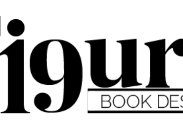
Logo Design Refinement
The decision regarding which custom logo concept was right for them took very little time. Next we went about tweaking details such as the speed lines (Five of them to represent the five members of the Jessup family), the angle of the arrow, and the tracking of the letters. Here is the final logo and secondary mark.
Brand Mood Board
Then I put together a mood board to capture the way that I understood the look and feel of the brand. Some images were from free stock and others from paid stock sites. I provided links and instructions to the client on where to find them and how to purchase them if they so chose. It was important to note that because I had not purchased the images, many of them were still watermarked.

Color Palette
Next we went into color palette development. This proved to be the trickiest part in this project. Finding colors that conveyed the desired message, worked well on the web and in print, and provided plenty of design options for the business to use going forward was a challenge. Again, I started with 3 concepts:


After much discussion and some back and forth, this is where we landed:
Typography / Font Stack
The quickest part of this project was the font stack (typography selections). Based on the discussions we had previously had and the overall direction of the brand, I made some selections and Jessup Archery accepted them with no edits. Here is what we chose:

Social Media Kit
The main way that Jessup Archery is using their brand at this early stage is through social media, Facebook (Meta) specifically. So I put together a profile image using their secondary mark and a cover image conveying the look and feel of their brand. Here is a mock-up:

Brand Style & Usage Guide
Finally, a brand style and usage guide was necessary to help guide these entrepreneurs on their brand building journey. They were especially excited by the merchandise mock-ups that I included for inspiration (as this is a part of their business plan that provided impetus for seeking a professional brand identity).