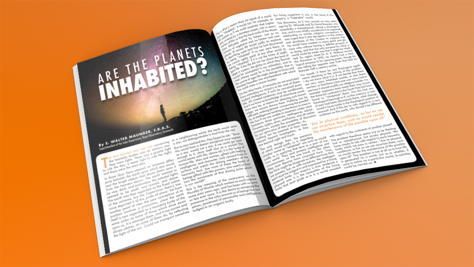
Another student project that I am fond of, is this exercise in which a single article is delivered in two ways. Choosing imagery and setting the typography so that it fit in the physical space and in the psychological space of the imaginary magazine’s genre.
The layout to the above was intended to fit in with a science journal or more professional publication. The other, pictured below, was intended for a more casual readership, for those who have a cursory interest in the topic, but are not experts.
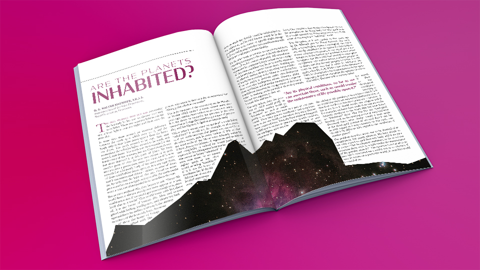
Attention to detail is incredibly important in layouts of this kind. Avoiding excessive hyphenation, odd looking spacing, or single words at either end of a paragraph or column can make or break a typeset design. Finding the right balance between line and column length, line spacing, and imagery is tricky business. All of these seemingly small details, come together to create a beautiful text layout.

