Custom Designed Business Logo
The Business Background
The words “Upper Crust” and the bakery’s French heritage call to mind elegant patisseries on the Champs Elysees in Paris. Yet the dedication to local ingredients and freshness harken to something more familial. They needed a custom business logo to express their unique value proposition.
The Logo Goal
The ultimate aim of this custom design is to highlight the unique point of difference that sets Upper Crust Bakery apart from its competitors. Inspired by its successful merger of heritage with future planning, international cuisine with local ingredients, and elegance with friendliness, the result should be both elevated and approachable.
The Custom Solution
To reach the target audience, which spreads a vast age range and both genders, this custom business logo design focused on the duality of this special place where the pastries can be both beautiful and homemade, recipes steeped in tradition and made daily with the future in mind.
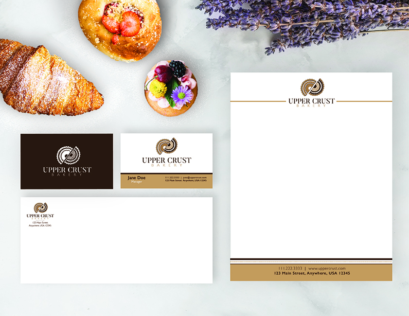
This custom business logo’s inspiration: When you walk into the Upper Crust, the smell of our fresh baked breads, muffins, and pastries fills the air. We have pride in our products and have passed down our recipes through the generations from our home country of France. When you are in the Upper Crust, we want you to feel the essence of Paris!
Building the custom logo
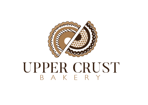
The logo symbol was built from layered shapes forming mirrored hemispheres that resemble two semi-circular pastries creating symmetry and balance. Setting these slightly apart to take advantage of gestalt principles provided by the negative space, and angled to break the symmetry, add interest as well as movement. Within the hemispheres line weight varies between thick and thin to continue the theme of duality. Circles and arcs repeat throughout to provide a sense of rhythm.
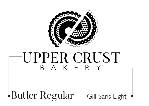
The typography also speaks to the theme of duality. The bold serif font offers a thick-thin quality and a rather traditional feel. The subtext consists of a slightly rounded, light weight, sans serif font that projects a decidedly more modern, friendly vibe. The larger headline font is tracked closely, whereas the smaller subhead font is tracked very widely. These pieces create balance and harmony between contrasting elements.
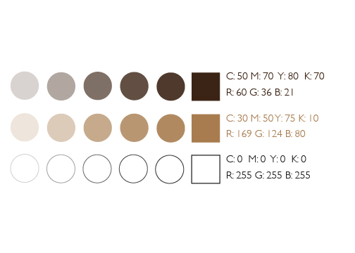
This reserved palette features two brown hues, a light mocha and a darker chocolate, along with white. The browns speak directly to the product offering as pastries are often brown tones. They also hint at the environmentally-friendly locally sourced ingredients. At the same time, this combination appears refined and elegant. These colors serve their intended purpose without being cliche or overbearing.
