
Brand Identity Design Services
The Design Brief
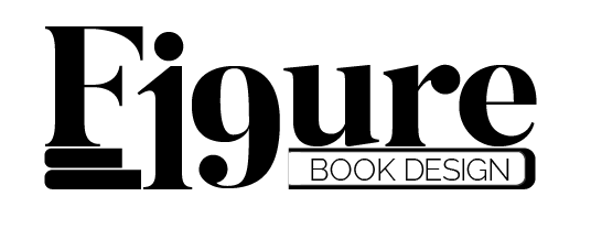
I created this brand and its identity as a part of a student project, but it is representative of the reasoning I apply to all of my brand identity design services. It required a brand identity design and a digital collage representing the brand. This fictitious brand acts as a book design and marketing agency. The name plays off of the image designators known as “figures” in publications and the number 19 which mimic the characters “i” and “g” from the word.
Brand Identity Rooted In Typography Design
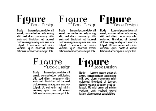
First, I selected fonts looking specifically for typefaces that had digits 1 & 9 that mimiced like characters i & g. It was important that the font exhibited enough weight to stand-alone as a word-mark and enough personality to be interesting. Then, I paired select serif fonts with a block of lorem ipsum in sans serif (Raleway) to see the logo next to body copy. Finally, I chose Butler Extra Bold, because the weight contrasted nicely with the sans serif. The thick/thin quality of the serifs played an important role in the decision. It exudes a “bookish” feeling without being generic.
Customizing the type to design the identity
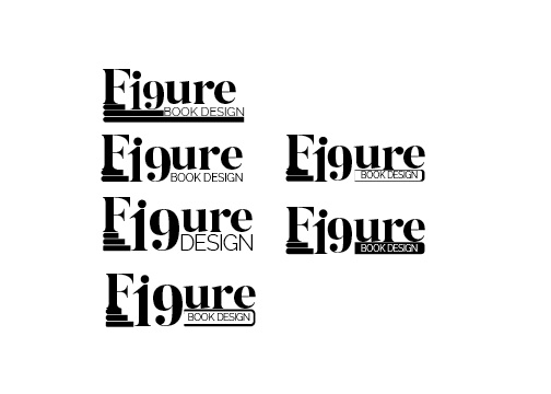
I lowered the baseline on the 19 in order to make it sit in the correct position to replace “ig.” By doing so, this left a gap under the rest of the word. Filling the gap with the words book design, also served to define the purpose of the brand within the logo design. The characters received some tracking and kerning at this juncture.
The tittle over the 1 makes the character look more like an “i”. Replicating the circle size that already existed in the 9 and the r of the typeface. As a result, these three circles make a triangle that leads the eye through the logo.
The Brand Identity Logo Design
See the finalized design for the brand identity below. Later, it was suggested that removing the tittle over the i would make the mark appear cleaner. I debated with myself about removing it, as I thought that it added a level of personification to the mark. What do you think?
Brand Identity Digital Collage
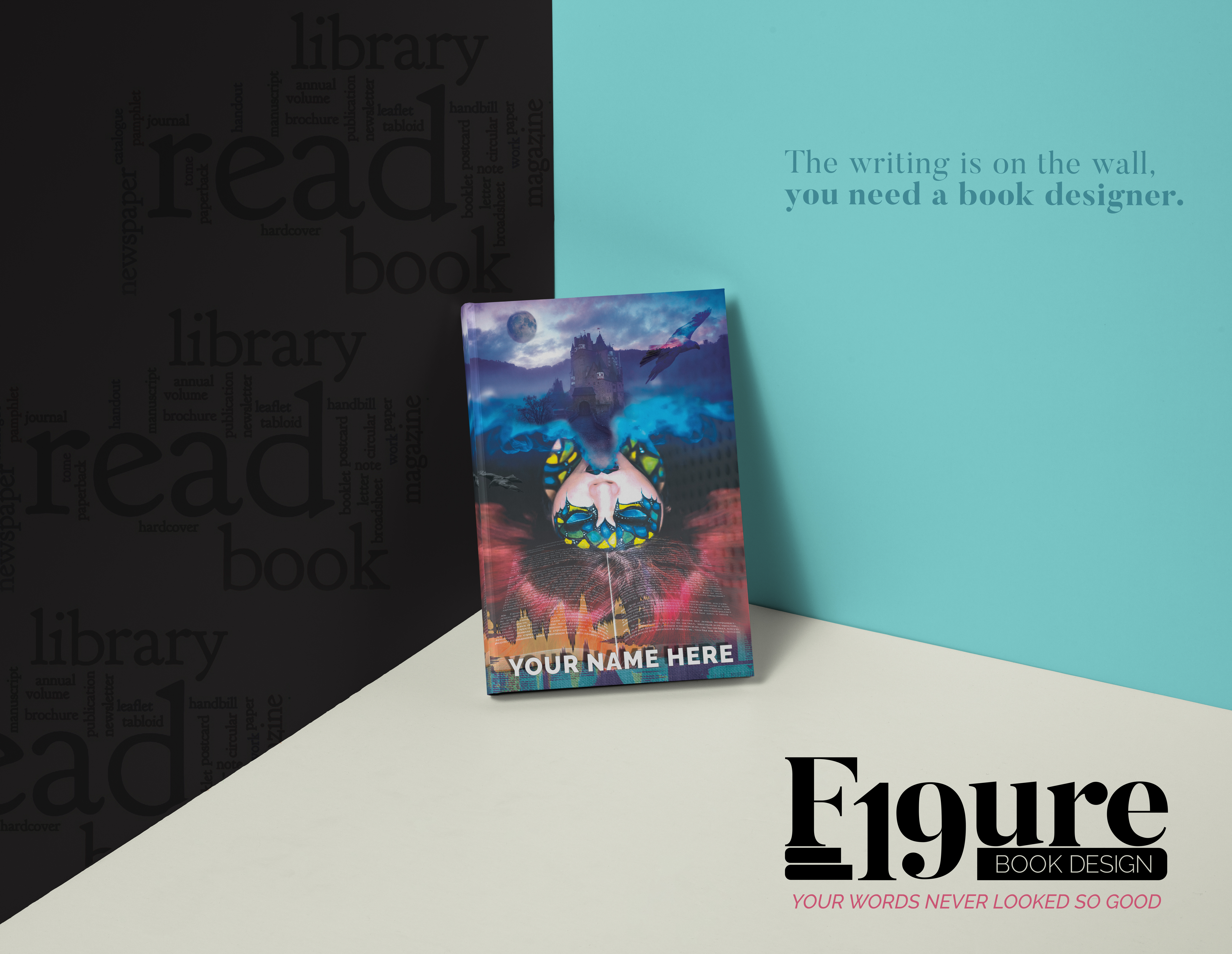
See the digital collage created for this project below. The book design brand lent itself to being displayed as a book cover, which can be seen in the first image on this page. However, I thought it would be fitting to share the full artwork here. It could easily be adjusted to work as a poster as well.
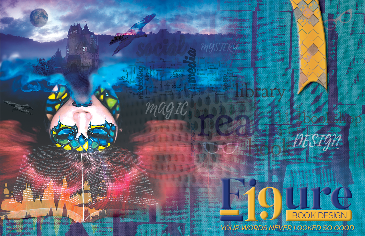
The book cover design grounds this advertisement design for the brand.